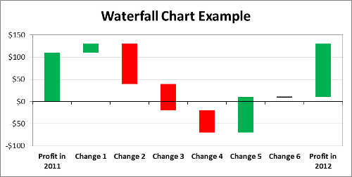
This tutorial shows you how to use the waterfall chart template file Excel that supports negative values and columns representing no change.
Download here to download: Waterfall Chart Template
How to use the template?
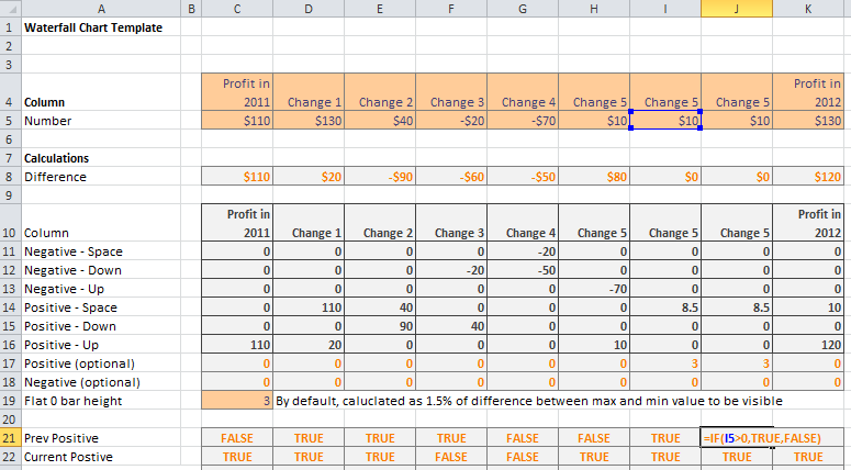
The template is ready to use right out of the box. All you need to do is change the input cells
- Enter the values for each waterfall column in row 5
- Enter the desired axis labels in corresponding in row 4
How to add more columns?
- Try to add and delete columns before you have made any changes to the template. If not possible:
- Backup the file if you made changes and you want to be safe in case you break the file
- Save the input values on row 4 to 5 so that they can be used later.
- Highlight entire column I. To highlight an entire column, click on the Column Heading (the letter “I” at the top of the spreadsheet). Highlighting only a part of the column may break the file.
- Right click -> Copy
- Do not click any where else, and right click on the current selection -> Insert Copied Cells
- Repeat step 3 to 4 until you get the number of columns desired
- Highlight column D
- Right click -> Copy
- This step is really important as it fixes the shifted formula. Highlight all the new columns you created in step 3 to 5 and previous column I (would be shifted to the right so it is somewhere else now).
- Paste formulas over of those columns: Paste special -> formulas (Shortcut: Alt e s t Enter)
How to take away a column?
- Try to add and delete columns before you have made any changes to the template. If not possible:
- Backup the file if you made changes and you want to be safe in case you break the file
- Save the input values on row 4 to 5 so that they can be used later.
- Highlight entire column E. To highlight an entire column, click on the Column Heading (the letter “E” at the top of the spreadsheet). Highlighting only a part of the column may break the file.
- Right click -> Delete
- Now you will notice that there is a bunch of “#REF” errors in the new column E
- Copy the formulas over to the column with errors: Highlight entire column F -> Right click -> Copy
- Highlight the entire column E (the column with all the errors)
- Paste formulas over of those columns: Paste special -> Paste as values (Shortcut: Alt e s t Enter)
How does it work? What is behind the blackbox?
This section is not necessary for using the actual template. But it is useful for those who are curious about how the chart actually works.
The waterfall chart is a stacked bar chart, each column has 8 series (each is a row in the table below), each representing:
- Upward change (green) in the positive region in the bar chart (values above the x-axis)
- Downward change (red) in the positive region
- Spacer to properly position the bar at the right height in the position region
- Upward, downward and spacer in the negative region (values below the x-axis)
- Positive and negative optional 0-change bars: The back line you will see if a column does not change from the previous one (See the column “Change 6” from the waterfall chart example at the top of this tutorial)
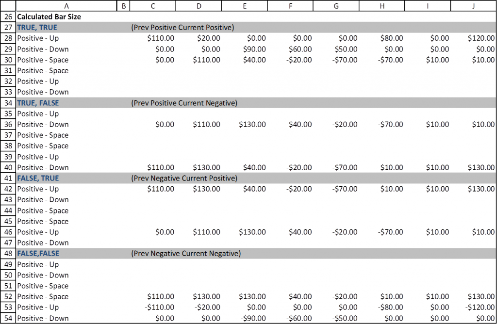
The actual calculations of the length of each bar (green, red, spacer, etc.) is done at row 26 to 54. There are four sections, each calculating the appropriate bar lengths based on 4 cases:
- Previous value is positive, the current value is positive
- Previous value is positive, the current value is negative
- Previous value is negative, the current value is positive
- Previous value is negative, the current value is negative
You can look through each cell to understand how each of the bars (positive – green, negative – red, and the spacer) are calculated on each of those cases. 
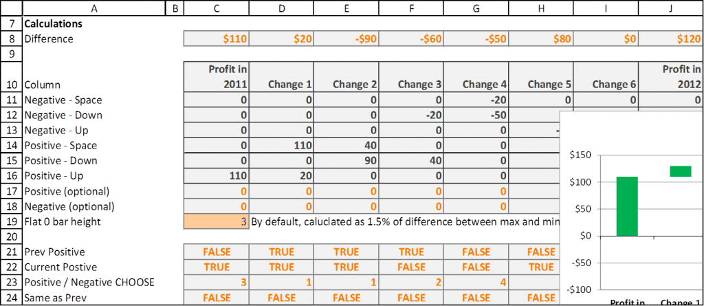
Row 22 then calculates which case to use (1 to 4) based on whether the previous and current values are positive or not (rows 21 to 22). Row 24 indicates if the current value is the same as the previous value, in that case the option bars are used, and all other bars are zeroed out (rows 11 – 18).
There you go! Hope you enjoyed this brief tutorial and find the template useful.


I’d suggest that this would be more useful if the inputs were the differences. Not many people will start off having the data for the number row; they are much more likely to have what now appears in the differences row.
Lotusaurus, I’d say it depends.
However, this can be easily worked around by having the differences on the sheet, and calculate the values by adding the differences.
Is there any way to fix the data labels? When I add data labels for the bars that are in red, it comes up with “0” as the data label. The green labels work fine.
Thanks
Ryan, I will actually have to add that as a feature. This may be available in the future…
This was outstanding. Thank you so much!
This is awesome. I appreciate the work.!!
This does not seem to work well when the first value is a negative. Is i possible to send you my file and let me know if it’s anything I’m doing wrong? I’ve followed your directions meticulously and validated the formulas are populating correctly.
Also – I could be wrong – but are the titles (first column) of the last sections of the document labeled wrong? I don’t see any values starting with ‘Negative’.
JPK
Possible to change from $ to a other currency?
I have come across many waterfall templates and this is one with a easier to use interface. Well done!
Have you tried to make a clustered stacked waterfall?
Nanis, that sounds like a worthy challenge and will be my winter project.
Great functionality, thanks for sharing. Couple questions 1) should the last bar should go from 0 to final value? currently it is floating in the example file. Fix: zero out cell O12. 2) is Row 4 mislabeled? it says ‘changes’, but it looks to be the moving totals, or cumulatives.