This tutorial will show you how to create a clustered stacked column bar chart – step-by-step, so there is no way you will get confused. If you like this tutorial and find it useful, have questions or comments, please feel free to leave me a comment! I would love to hear your feedback!
Download here to download: cluster stacked column bar chart Excel template
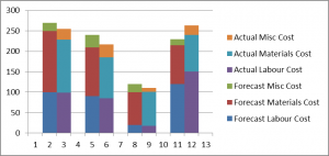
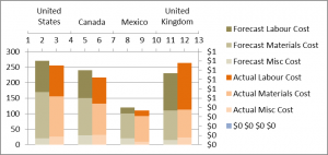
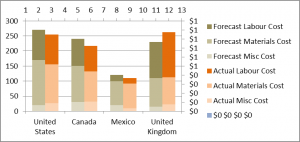
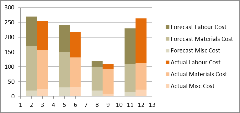
Here’s an example of what a clustered stacked column bar chart looks like:

This is the clustered stacked chart.
Laying out the Data
- Create a copy of the data table by setting cells to equal the original table
- Shift cells to create separate row for each stack
- Add separate row for each cluster
- Add column headings
- Create extra row between the column headings and first row of data

This is how the cells should layout in the cluster stacked table. The second stack is 1 row down from the first stack.
Creating the Chart
- Highlight the copy of the data, and create chart by Insert -> Column Chart -> Stacked Chart

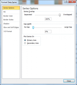
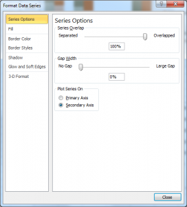
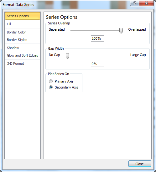
- Eliminate all gaps by right click bar chart -> Format Data Series -> Series Options -> set Gap Width to 0%
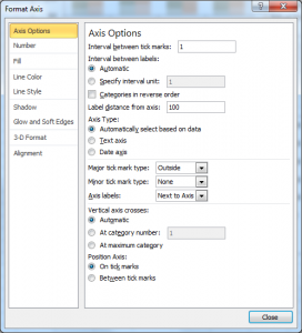
- There should only be half a gap before and after the first and last bar respectively. Right click bottom horizontal axis -> Format axis -> Axis Options -> Position Axis -> On tick marks

- Re-order data source to desired order for bar chart (optional)
- Fix coloring to desired colors (optional)
- Change chart component sizes (optional)


Fixing the Axis
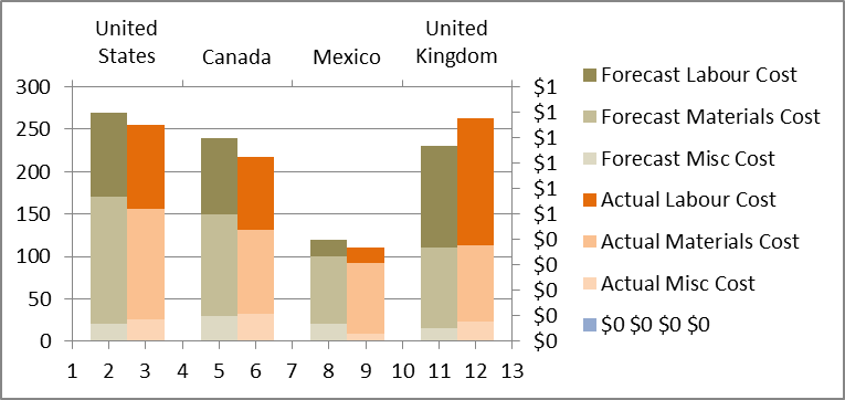
Up till now, we have something that looks like a stacked clustered chart, but need the x axis to have the right category labels, grouping the stack bar charts.
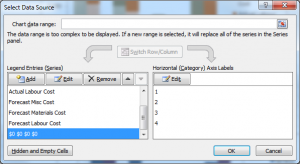
- Add a dummy data series. Right click on chart -> Select Data -> Add -> Series values -> Highlight a number of cells based on the number of categories in chart (just 4 in this example)

- Set the dummy data series to the “secondary axis”. Layout (Ribbon) -> Select the dummy data series -> Format Selection -> Plot Series On -> Secondary Axis (if you are having trouble selecting the dummy data series you just created, just change the values to something so that it can be selected, and change it back after you are done this step)
- Set the Horizontal Axis Label for the dummy data series into the category names. Right click chart -> Select Data -> Select the dummy data series (left pane) -> Click edit (right pane) -> Highlight the category names


- Move the category names to the bottom of the chart. First, move the axis on the bottom to the top. Right click the vertical axis on the left -> Format axis -> Axis Options -> Position Axis -> Horizontal axis crosses: -> Maximum axis value
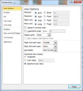
- Second, move the category axis to the bottom. Right click the right vertical axis -> Format axis -> Axis Options -> Position Axis -> Horizontal axis crosses: -> Automatic

- Delete the dummy data series from the legend
- Delete the right vertical axis. Left click and select the right vertical axis -> press “Delete” (keyboard)
- Hide the top horizontal axis. First, get rid of tick marks. Right click on the top horizontal axis -> Format Axis -> Axis Options -> Major tick mark type -> None.
Get rid of the line. Line Color -> No line -> Click Close - Hide the text on the horizontal axis. Left click on text on top horizontal axis -> Change font color to white.
- Hide grid lines (optional) Right click on grid line -> Format Gridlines -> Line Color -> No line
- Resize various chart components to your liking (optional)


Thanks for the information. Really useful:-)
THANK YOU! This is really great and clever!! 🙂
very smart technique
I want to do exactly this but I want the stackings to be the same for each cluster; so in the example you post, United States and Canada would be broken down by the same metrics and color.
This is for different loan types for a particular lender versus it’s peer group. So under each month, say January 2012, you would have two columns – one for the lender, one for the peer group – and then each column would be stacked by the same metrics and colors. Please advise if you can and thank you very much.
Adding dummy comment doesn’t make sense. Does this not work in Excel 2007?
Excellent advise except on how to eliminate the gaps. You have to right click on a “data series” within the chart not right click the chart. The only way I couldget the “Format Data Series” is when I right clicked on a data series with the chart.
Excellent work done !! I was looking exactly for this kind of a chart.
Hi This has been veryhelpful but I am unable to delete the “dummy data” from the legend. Assistance please.
Step 3 doesnt put the category names at the top like it should. Any suggestions?
When my horizontal labels need to be dates, this does not seem to work. Any reason? I have excel 2010.
Thanks very much. Very useful with clear instructions!
Worked as mentioned! Thanks for this great resource
Excellent tutorial, and thanks to Sharon for helping me out with eliminating the gaps! 😎
Excellent tutorial and cleverly done. One improvement suggestion. In step 9, instead of making the labels white, you can do the following:
Right click on the top horizontal axis -> Format Axis -> Axis Options -> Axis labels -> None
This has the benefit of freeing up the space the labels take up and also ensuring that the ‘hidden’ labels don’t appear if the document is printed.
Result of “fixing the axis” no. 3 looked differently: second/category axis did not spread across the full chart but stayed at the left of the chart. Any advice? Thx!
Thanks, very useful.
I am having problems with step 3 of Fixing the Axis. I am not able to put the secondary horizontal axis labels, which are my categories for the clustered stacked chart.
Any clue how to do it?
can you add a cumulative line for actual and a separate one for forecast?
Very useful and excellent step-by-step instructions. Great job!
Very useful and excellent step-by-step instructions. Great job!
Thank you very much. Simple, elegant solution and clear instructions.
Thank you very much. Simple, elegant solution and clear instructions.
Excellent tutorial!!
I am trying to add standard error bar in my stacked column chart. Would you please help me how to do that?
Extremely helpful. Thanks
Thanks. This was so useful!!!
Very good, it worked like a charm.
It is not always super easy to follow (Layout (Ribbon) -> Select the dummy data series -> Format Selection >> this is in the top left section of the Ribbon, where the different parts of the chart can be selected. that was not clear initially and would have been great to add a screenshot of it. Once I found it, I could do without adding extra data in the dummy series.
It is very important to follow this order, else Excel messes it up.
One final thing that I am curious about:
Why do you work with the MAX and the INDEX formula? Instead of MAX, I have just added the numbers myself. Instead of INDEX, I just put a normal reference into each cell to tell Excel where to grab the data from (e.g., =E10).
Why complicated when I can do it with more ease?
Maybe there is a reason…
Thank you in any case, keep going.
Daniel
It was very helpful. I didn’t understand the adding dummy series. Also I could do without adding this
On step 3 the Secondary Horizontal axis doesn’t seem to show up. To fix that go to the top buttons in Excel – click Layout tab – Axes – Secondary Horizontal Axis – Show Left to Right Axis
Thank you so much for this comment!! I wasn’t able to fix it my self haha
Just I was breaking my head for long time and then came across this tutorial and it was very useful and I could do exactly what I want to do. Thanks
Worked like magic!! Thanks really useful!!
Thanks so much for creating this tutorial. I was very happy with the results, and the directions were clear and easy to follow. Much clearer and easier compared to others that came up the search. Using your method both improved the process and results of my research project. Thanks again!
Brilliant – but somewhere between 3 and 4 I can’t get the Horizontal labels to appear at the top. I’ve got my numbers at the bottom left and right – but when I edit the horizontal it won’t appear at the top?
What am I doing wrong?
Excellent tutorial! I wonder why you can’t do this type of chart directly in excel.
This is great! Now how do you add a secondary axis with numbers to be plotted over the original stacked bars?
Thanks
awesome! Thank you for the great tutorial!
The template you have created for the clustered stacked bar chart is great! I have one problem I wonder if you can help me with. I copied and pasted the chart I created with your template into PowerPoint which worked fine. Traditionally, I can copy a PowerPoint slide, edit the data in EXCEL, and then have another version within the same presentation, but with different variables/data. With this template, all duplicate slides are linked to the same EXCEL sheet and so all slides conform to the same data at all times (if I change one, it changes them all). Is there a way around this without having separate EXCEL sheets for each slide’s bar graph? Many thanks! RQ
Exactly what i was looking for, and it worked perfectly first try!
Thank you so much!
Thanks for the tutorial. I managed to work my way through this last year with Excel 2010, but now that we have moved to Excel 2013, the charting methods have all changed, so the tutorial might need an amendment or addenda.
great directions – thank you!
Fantastic! This was one of several articles I attempted to use to achieve this task and yours was the one that was successful for me. Clear, easy to follow, and thorough. Thanks SO much for taking the time to put this together for others!
This doesn’t work after a certain number of columns
You’re an absolute Legend 😆
This is very good. It was very helpful.
Really clever approach, but not working for me I am afraid. It is in the dummy range, I follow the steps and the categories all cluster together to the left of the axis.
I have 10 stacks, 2 per year, and everything works up to but not including the dummy data set creation. Everytime the dummy data set, just gathers to the left of the chart, does not space out in the same way as the primary data set.
8 of 10.
I’m having a challenge making this work for the solution I want and not certain it can be done. The data is as follows
sales 100
cogs 30
payroll 25
occupancy 10
G&A 15
I need the column to show 100 as the highest point and the other components are imbedded within as relational. Has anyone done this? Perhaps I’m overlooking something but when I use the methodology the column height becomes 100+30+25+10+15=180.
Can anyone shed some light?
Mike
Whoaaa.. Thank you.. Great!
🙂
Thanks for the assist. I was having trouble with a complex stack bar chart. The tutorial was excellent help, well written and easy to follow presentation.
I have found that if you need a secondary axis this method does not work since you plot the dummy series against the secondary axis 🙁 I may be wrong but other than this it is a great tutorial thank you!
To solve this problem I did not create a dummy series, so as to not mess with the series that is already using the secondary vertical axis.
I have three stacked columns the third of which uses the secondary vertical axis. I used the original horizontal category label but deleted all but one of the 1’s and all but one of the 2’s. I changed the 1 to the first month and the 2 to the second month.
Lastly I right-clicked the primary horizontal axis (now a series of the form: {“”,”March”,””,””,”April”,””}) and set the interval between tick marks to 3.
No need for dummy axis in this case where there is an odd number of stacked graphs for each category.
Cheers.
Easy to follow. Nice tut!
I want to make a clustered and overlapping column bar in Excel. I’ve searched all over and can’t find any way of doing it. I have 7 bacterial strains, each exposed to 7 compounds. They change their resistance to the compounds (wt and mutant) which is what I want to show with the overlap. So I want groups of 7 strains, each of them with two overlapped values, for 7 compounds. Any ideas?
thanks!
HELP! I want to show a stacked column with three different sets of values for each month for two different companies. IE July to June – Company A stacked column (3 sets of values) and in another stacked column (3 sets of values same description as Company A but different amounts)also for July Company B. Hope this makes sense.
This is great! Thanks so much for sharing!
Thank you, great technique!